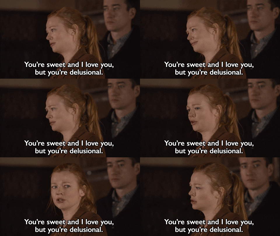
Monday, 3 May 2021

Judge My Book By Its Cover, Part 1...

Thanks, Shiv!
Once again, overwhelming evidence has been presented that indicates I'm not as clever as I think I am. Remember when I riffed about my delusion over the fluency of my German? Remember when I equated that to the depressing realisation I'm far less computer literate than I thought? Well buckle up, folks. I'm taking you on another wild ride. Let me talk you through the latest lesson in humility that's been handed down to me. This one's a cracker.

The lounge wall of dreams!
Back in December, I got to the point in Book Three (AKA Assembling the Wingpeople) where I needed to sort the front cover. The first part was easy. I got in touch with Gary. Gary is a friend of a friend who  - fortuitously for me - creates excellent covers for the books I write. When I contacted him in 2016 for Carry the Beautiful, I hadn't a clue what he'd come up with. Happily, it transpired, he's a genius so it all worked out. He designed three different choices, all of which were marvellous, and I eventually picked the one I liked best. When Leeza McAuliffe Has Something To Say was brewing, we repeated the shebang and he came up with the goods once more. The front cover is the one part of the publishing process I lose zero sleep over. (That's little comfort when there are approximately 4563 other areas to keep me awake, but don't mind me. Just having a mini-rant for a sec. Let's crack on.)

So where were we? December came, I emailed Gary, and checked he was up for the latest challenge. He was. Whoop! I then had the task of sending him the brief. Now this makes me sound like I know what I'm talking about. 'Sending him the brief.' Get me. What that really meant was waffling away in lengthy bullet-pointed lists about the themes, motifs, characters and plot of the book. So much so that it would have been quicker and simpler for him to read the whole thing. Honestly, it really forces you to focus on what your story's about when you have to describe it to someone who will be creating a visual representation to hook in readers. Did I mention Gary was a genius? Yeah, he wasn't fazed. He took it in his stride. He accepted my brief without emailing back 'WTAF Nicky?' A legend.

I've just checked back over what I sent at that time, and it's pretty bad. Here's an extract. See?


Just to be clear, I emailed him photos of sunsets, in case he wasn't familiar with the concept. I know. I'm horrific. I also used the phrase 'heads on the cover' far too many times for comfort. I honestly thought I had a clear idea in my mind of how it should look. Sunsets, orangey colours, a seaside vibe, and of course, the classic 'heads on covers' trope that is sweeping literature as we speak. (It's not.) Reading this back makes me blush at how pointless my nonsense was. But hey ho, that's how I rolled. To be fair, I did send some more basic information. This is the bit that might have been useful. Who knows? I added...
  •  This book is about dealing with the unplanned events and challenges that life throws up. Bereavement, divorce, ageing, and trying to carve out a meaningful life against the odds. But it’s also funny!
  • The book also features (and builds up to) a reunion of old friends, so there’s plenty of 90s references along with the ‘getting older’ stuff. 
  • The title – Assembling the Wingpeople – refers to finding a support group of new friends, when you’re starting over. When all your old friends and family have been lost along the way (divorce, moving away, etc) assembling the wingpeople means creating a new set of mates to have your back.
Do YOU need help
with the concept of
a sunset? Look
no further!
So there we have it. That was the brief. I thought I had a good idea of what would come back, based on the 'excellent ideas' I'd shared. You know? The orange sky, the seafront, the three heads with knots inside (?) I felt like I was on top of this. I felt like my clear grasp of aesthetic ideas would be more than helpful in guiding the design process.

When Gary sent through his initial ideas, he'd surpassed himself. Firstly, there were six concepts to choose between. I was quite literally spoilt. Secondly, he had listened to my 'guidance' and mocked up suggestions based on my thoughts. Two of the six were orange in tone. Four of the six had a seaside colour scheme or background, and four of the six had three heads on the cover. I know, he really did humour me. Gary treated me and my 'helpful' ideas with respect. I couldn't have asked for more kindness. 

There was just one issue. As well as all the orange three-headedness, there was one cover that didn't contain ANY of my ideas. It didn't feature a beach scene, there was nothing that could be interpreted as a sunset, and there wasn't a peek of a knot-filled head or three. Gary, who let's remember is an actual designer with skills, talent, and an artistic eye, had come up with something unrelated to my 'ideas.' And here's the thing. It was perfect. 

Yep, the cover that blew me away was the one that had nothing to do with any thought or idea I'd shared. And that's when it really dawned on me. Oh shit! I'm not a designer. I'm not an artist. I have no clue about book covers and should never have begun to think I did. It was an eye opening experience. It's clear my C-grade GCSE in Art and Design really was a general standard of education, and didn't provide the insights into the graphic design profession like I'd assumed. Thank God for Gary, being brilliant and taking charge.

Soz folks. A bit of patience required.
And now I've given you the context, I know what you want. You want to see the book cover that put me in my place and reminded me to wind my wannabe-designer neck in. Well fair play to you. I'm ready to share. See you back here this time next week, and it's all yours. 

Have a lovely week, folks.

No comments:

Post a Comment